At the time that I began working on the Facebook Audience Network brand, it had just been given its first brand identity kit with a logo, color palette and fonts. There was no "brand" per se as there was no brand proposition, no emotional connection or visual language for the brand. The brand was underfunded and relied on stock photography so every image from the brand (and from Facebook Business) looked identical - someone staring at a device. To alleviate the restrictions of this system, I adopted illustration as the means to do more expressive work that not only allowed complex concepts to be explained but also room for playfulness, creativity and innovation in the rigid, straight-laced space of ad tech.
To my great delight, when the Facebook company rebranded in 2020 as a sub-brand of the Facebook company, Facebook Audience Network got the chance to rethink its logo, color system, typographic system and the use of photography and illustration in a whole new, sophisticated way. All the knowledge I had accumulated working on this complex business brand came to fruition as I led the relaunch in partnership with the Company's business and consumer teams (in partnership with agencies Saffron and Future Brands), informing company-wide systems on the use of illustration in service of B2B brands.
The new system is showcased below, with some references to the old.
Logo
The symbol lockup represents Facebook Audience Network’s ability to extend the reach of businesses. The metaphor’s graphic structure subliminally ties back to the ‘A’ in the Sub-brand’s wordmark. The movement created through color progression is a nod to the platform’s engine that enables growth through partnership, and the arrows created through the diamond structure have strong progressive directional movement and establish Facebook Audience Network as a leader. This is a powerful symbol because of its simplicity and clarity, as well as the sense of direction that it provides.
The old symbol lockup attributed to Facebook in an awkward manner which was resolved through incorporating the parent company name within the brand naming structure. Additionally, rather than incorporating the symbol within the wordmark, the symbol was completely separated from the name. However, the symbol is always locked up with the wordmark to establish a close association of the new symbol with the brand name.
Color
The Facebook Audience Network color palette is derived from the company’s empathetic color palette. The unique set of colors help the brand build its own brand equity while accruing value to the company. After much debate, we decided to retain the "purple/indigo" as the primary color as the brand had previously established equity in that color.
The secondary palette was chosen for the striking contrast to the primary indigo which is helpful when dealing with the gaming audience. Several tints of the primary indigo were provided so that there was no exhaustion from repeated use of the same shade while building the ability to really lean into the indigo. A supportive functional color palette was also incorporated.
Great detail was provided on how to combine colors correctly to ensure that white space was liberally used instead of overuse/misuse of secondary palette.
The old color palette was restrictive as there was strong emphasis on the use of the brand purple but there was only one shade to lean on. The other colors did not add sufficient punch or contrast for a gaming audience.
Composition
To create a strong link to the Facebook company, the composition (layout) principles derived from the Company standards. They ensured that the text did not have to overlap busy photography and the relative sizes of various elements were proportional.
Photography
Even though we relied on stock photography for the brand, we made careful selections that met our brand guidelines. The photography is people-centered, globally-relevant, celebrates diversity, shows the outcome of technology, uses clean and universal backdrops, even lighting, and features dominant use of colors from the Company brand palette.









Illustration
Developing an illustration-focused marketing approach for Facebook Audience Network was a strategic choice I made after seeing the limited opportunities and lack of budget for custom shoots and videos. Illustrations also allowed us to be more topic-specific and nuanced while telling a richer visual story. Due to the need for our brand to align with Facebook's overarching illustration system, we went through several transitions. My consistent efforts to push the boundaries and not compromise helped Audience Network find a unique voice in the market and also become the in-house experts on illustration for business.
The intermediate system of illustration show below was the most effective one that we worked with. At the point that this system was adopted, the marketing teams at Facebook had not embraced a clear system, so I built bridges with product design at Facebook to borrow from the system they were deploying for clear, concise and scalable illustrations that could be edited quickly, animated easily and remain lightweight. This was a win-win for product teams and marketing as we could adapt a system for our unique subject matter than build one from scratch. The illustrations shown below were the master illustrations for our website.
The system of illustration we moved to in 2021 is deliberately painterly, loosely structured (very few guidelines on how to create illustrations in this system) with the aim of making the illustrations feel more humanistic and a true replacement for photography. This illustration style was adopted by Facebook Audience Network based off the Company-wide switch to the system. It is harder to convey abstract concepts such as virtual bidding or processes in this system so rules had to be bent.












Whitepaper and Reports Template
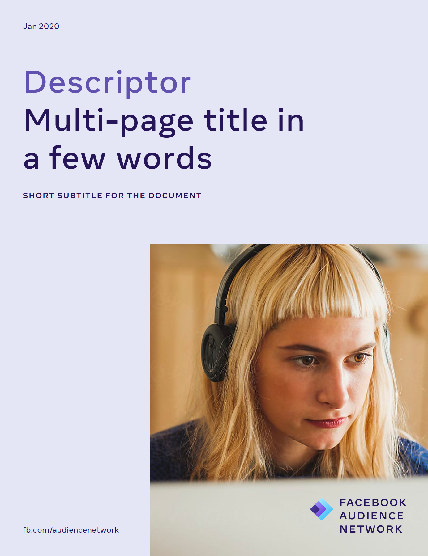
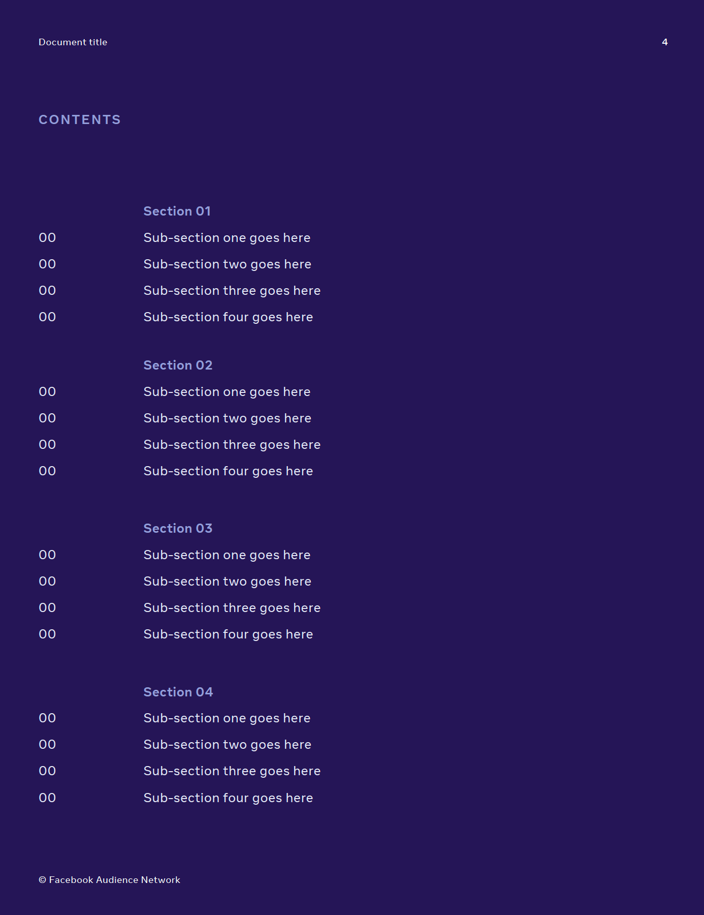
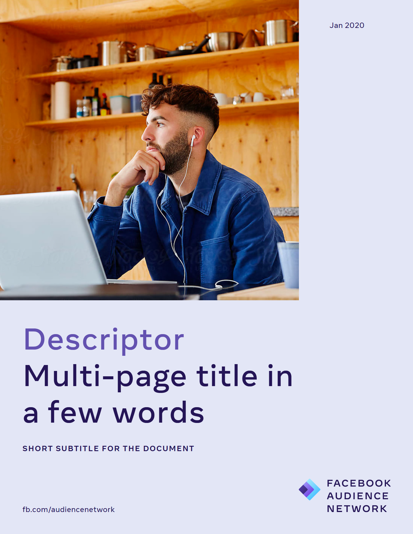
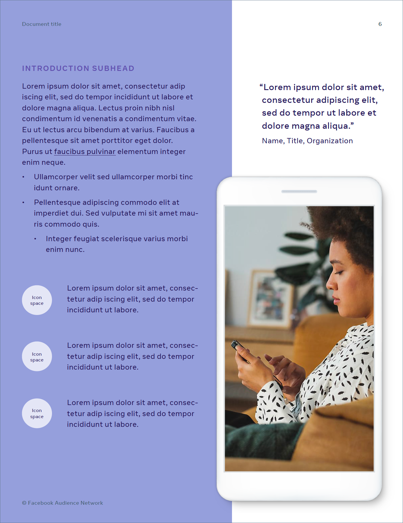
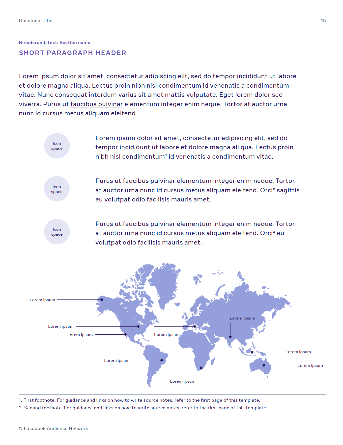
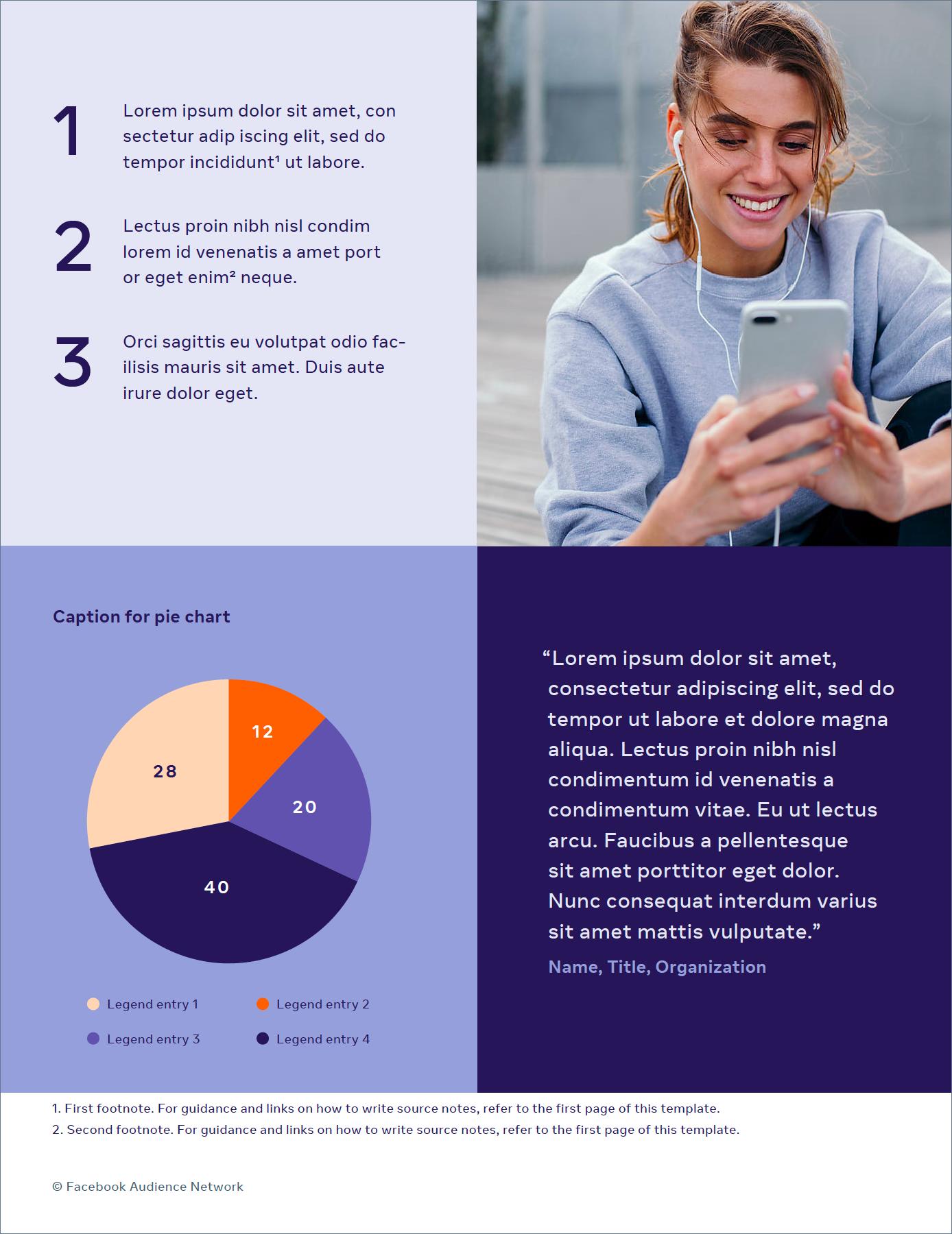
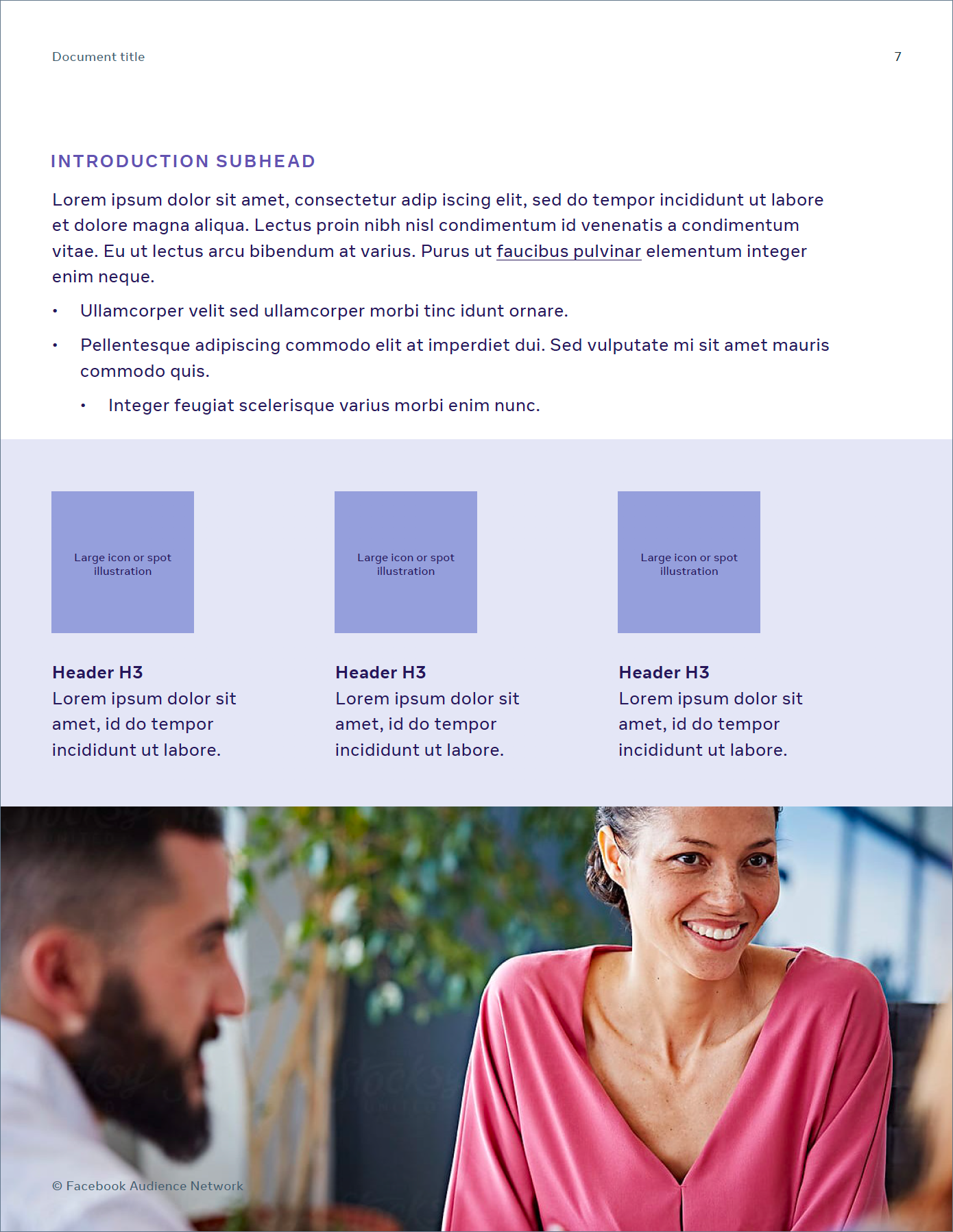
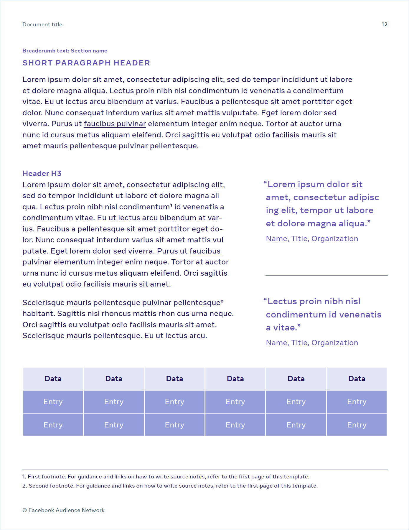
As a business brand, long form reports and documents were much-needed assets. This template extended the simpler layout language of the guidelines into real world needs.


Explainer Videos: Bidding and Mediation
Bidding is a complex concept but is starting to gain traction with developers. It is enabled through a transparent Mediation process through which Audience Network hopes to create fairness in the in-app ads ecosystem and create a better experience with ads for end users. These videos were the first to explain these complex concepts while using the new Facebook illustration system.
Website Updates
As a part of the upheaval of the brand identity, the Audience Network website was restructured from the ground up, in terms of content, strategy, UX and UI. The updates to the home page and the key section for bidding microsite are shown below.
Bidding Microsite
